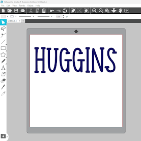
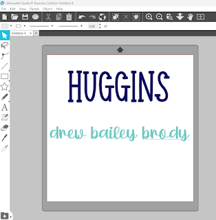
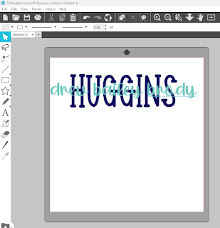
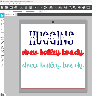
I then place the font over the top of the last name and use the align tool to align the names centered, vertically and horizontally with the last name. Although it looks great. The names don't stand out and make them hard to see. So...this is where "knock out" technique comes into play. We are going to add space and take it away from the last name so that you can better see the family member names.
You' are now going to put an offset around the family name. The offset I used was 0.075. I think it is just enough to give the names pop but not take away too much of the last name so you won't be able to read it. I've colored the offset in red and grouped the offset together. I then pulled the family names away from both the offset and the last name.
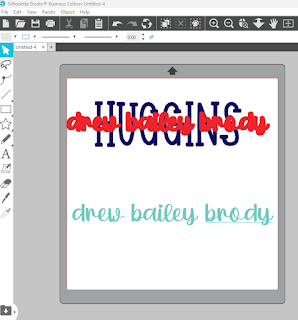
Now we select both the last name and the offset. We choose the subtract all tool (found in the modify panel). You won't initially be able to tell anything happened, until you pull away the offset. We don't need the offset anymore, so I'm just going to delete it.
Thanks for stopping by. I hope you found this tutorial
helpful. Please feel free to contact me if you have any questions or need
additional information.
If you like this post, please share it with a crafty friend and please share it
on Pinterest, so others can find it. If you are on Facebook, I would love for
you to check out my page and
join my crafting Facebook group!
In the FB group I like to share freebies, tutorials, and help with
troubleshooting, etc. The group's members are super nice and like-minded. We
all really enjoy fellowship and crafting fun. Hope to see you there!
Until the next time we meet. Happy Crafting!
Julie 💕
This post may contain affiliate advertising. What this means to you, is that if you visit a site, by clicking on a link in the post, we may make a commission based on your purchase. The price you pay for the product or service is not higher, and the commissions we earn help keep this blog, its tutorials and hosted Silhouette crafting events possible. Thank you for supporting our efforts!


